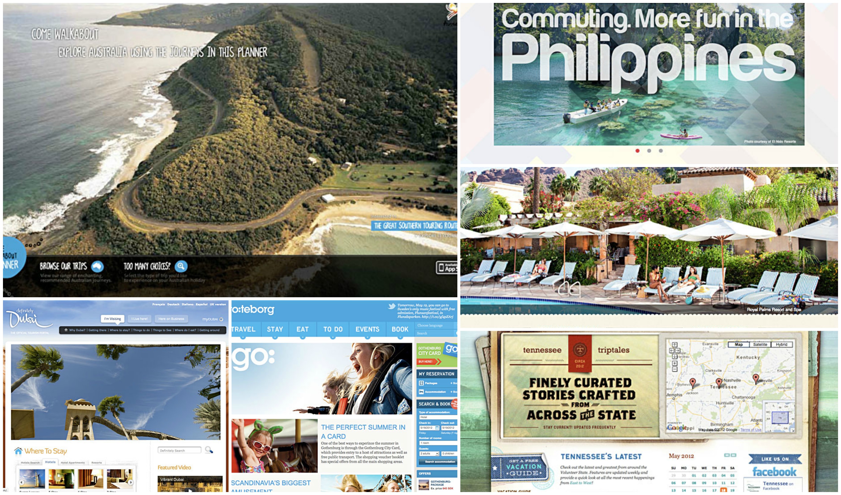
I looked around the web and found some of the most interesting and most well-designed destination tourism websites. What makes a tourism website great? When it gets you to really want to travel to that place! Like any of us, that feeling of wanderlust hit me this week and I began looking around the web for inspiration. So, here they are… of the best destination websites on the web today!
By Town:
Visit Telluride
http://www.visittelluride.com/
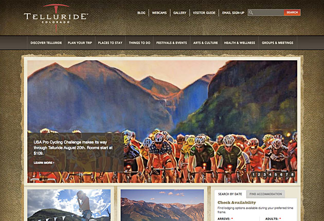
A well-designed, thoughtfully laid out site that represents the rugged brand of Telluride, Colorado. The site places a strong emphasis on community and small-town American values. The inner pages are beautiful designed but would be improved on if the use of a double sidebar was removed. The copy is well-written and engaging.
Interestingly, the site also provides live “webcams” where visitors interested in skiing can check the conditions at their favorite spots. There is also a “turn-page” interactive visitor guide, and the website is available in five languages: English, German, Japanese, and Portuguese. Overall this site is simpler than most, but well-executed.
High impact search queries for visittelluride.com
telluride, telluride co, helicopter skiing, telluride colorado, telluride ski resort, telluride hotels, ski resort, telluride mountain biking, madeleine hotel telluride
Yakima Valley
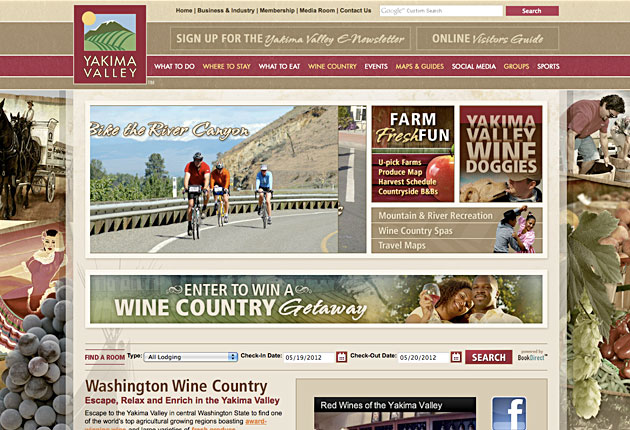
The strengths of the Visit Yakima website are its well-optimized for SEO pages, the use of bold decorative typography, and beautifully designed inner pages. Almost every page’s title is optimized for an important keyword phrase. The site’s brand gives an impression of heartland American values, and fun in the sun in the great outdoors. The logo is consistent with the visual direction of the website as a whole (unlike other sites such as Tourism Saskatchewan). The website is surprisingly fast-loading given the amount of images used: another sign that the site has been well-optimized for SEO. Much like Telluride, there is nothing high-tech on this site (it’s the polar opposite of Definitely Dubai), and the site background is a bit too busy; but the nice execution, use of strong visuals and good copy creates a winning site.
High impact search queries for visityakima.com
yakima, yakima lodging, yakima wa, yakima washington, washington wine country, yakima tourism groups, yakima valley, wine country, yakima chamber of commerce, yakima lights, maryhill winery, yakima fairs
By City:
Visit Denver
http://www.denver.org/
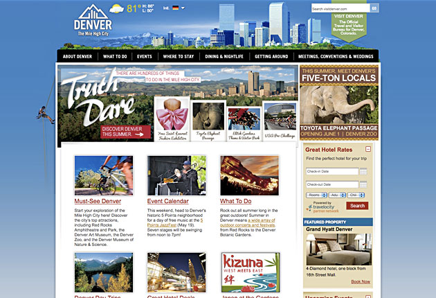
The website includes a extensive array of useful resources with an emphasis on things to do, places to stay, events, and dining & nightlife for visitors interested in coming to Denver. Also included to engage users are special hotel deals and discounts, and a mobile app. Unique to this site are “Denver Dare badges,” a referral program where users can “dare” their friends and contacts into certain activities in Denver. Earning Dare points enables special privileges and unique discounts to events.
High Impact Search Queries for denver.org things to do in denver, denver co, denver colorado, denver hotels, denver events, what to do in denver, denver aquarium coupons, hotels denver, events in denver, colorado, denver attractions, downtown denver, denver nightlife
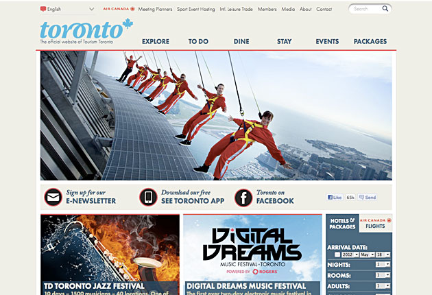
See Toronto Now
Another well-laid out site with a particular strength on its clean, bold typography (through the use of bold, capitalized Helvetica) and well-structured grid wireframe. The de-saturated grey background reminds you of snow. Well optimized for mobile, but the featured slideshow area on the homepage are just images and don’t lead the user down a path – they are not clickable links to pages and feature no headlines or messages.
The use of a sitemap in the footer makes navigation simpler for the user. The site’s applications and javascript features are very well designed and feature a clean, easy to use interface. The pages are well optimized for long-tailed SEO, but the homepage could be optimized better.
High Impact Search Queries for seetorontonow.com
toronto, toronto tourism, tourism toronto, toronto events, toronto canada, what to do in toronto, events in toronto, what to do in toronto, toronto sightseeing, toronto travel
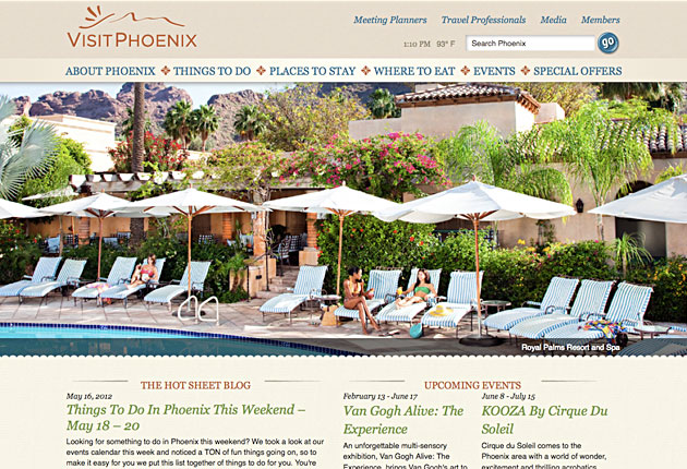
Visit Phoenix
http://www.visitphoenix.com/index.aspx
Beautifully branded website, consistent use of 3 colors. The de-saturated beige is symbolically used to convey a desert/mediterranean feel. Well optimized for mobile with large, fast-loading images and typography. The images of tourist attractions on the homepage, unlike Toronto’s site, feature information for the user and ARE clickable links that an interested user can click on to get more information about the attraction, successfully leading the visitor down a path, based on their interests.
Includes standard features such travel guides, blog, a trip planner. It’s easy to ask a question and speak with a representative, or follow Visit Phoenix through various social media outlets. Unique to this site is the “The Social Club,” where all of VisitPhoenix’s social media channels are featured in one place (http://www.visitphoenix.com/about-phoenix/the-social-club/index.aspx). Advertised as “It’s all things PHX right at your fingertips.”
Smartly, the site also features a dedicated “LGBT” area of the site – and for good reason, gay couples are known to spend significantly more when on vacation than straight couples do.
High Impact Search Queries for seetorontonow.com
phoenix az, phoenix arizona, phoenix zoo, phoenix, things to do in phoenix, phoenix tourism, grand canyon railway promo code, phoenix area, el chorro lodge, arizona state
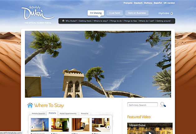
Definitely Dubai
http://www.definitelydubai.com/
The site for Definitely Dubai is chock full of interactive javascript applications. Each page has a different background which is consistently dark to contrast the clean white logo, but never too busy. The site is beautiful, but very slow loading. Users have the option to view the website in five different languages. The overall feeling of the page is modern and hi-tech. The site is divided into three main categories: an area for visitors, one for residents that live in Dubai, and another for information for others doing business in Dubai. A smart idea that delivers to different target markets, all from a single website.
High Impact Search Queries for definitelydubai.com
dubai tourism, dubai shopping festival 2012, dubai, dnata holidays, travel destination, definitely dubai, dubai shopping festival, hotel in dubai, rent a car dubai, dubai film festival
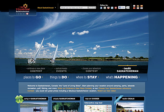
Tourism Saskatchewan
The website’s logo is red, but the website overuses a deep, dark, de-saturated blue. There’s a nice use of contrast by using white lettering against dark colored backgrounds.This site chooses to first promote their contests in order to interact with and engage users, specifically, the “Embrace a New Place” contest and “Choose your Adventure” contest. Users can enter to win a vacation contest, where during the process all of their contact information is captured for follow-up. There is only one grand prize but no doubt there are promotional “second prizes” such as deals and discounts to promote tourism to Saskatchewan. Overall, the contest setup is worth studying. The site includes standard tourist options such as “Things to Do, Places to Go, Where to Stay, and What’s Happening.” Included are a live chat app, an interactive google maps app. The newsletter is called “SaskSecrets,” an intriguing name for a newsletter, which may improve response.
High Impact Search Queries for sasktourism.com
saskatchewan, provincial parks, saskatchewan vacation deals, saskatchewan canada, radisson hotel saskatoon sask, canada tourism, saskatchewan tourism, saskatchewan map, saskatchewan facts
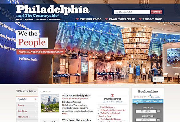
Visit Philly
The site uses a bold Georgia font for its headings and navigation, and Georgia for the body copy as well. The result is a more formal looking website and brand then most websites, which typically use sans-serif fonts such as arial. It also promotes a consistent brand image: for example, the social media boxes are custom designed boxes using the exact same bold Georgia lettering. The site is loaded up with features, images, galleries, and information on places to go and goings-on in the city. A nice touch are the pre-planned, “Done for You” itineraries such as: “The Presidential Itinerary,” “A Weekend is More Fun in Historic Philadelphia,” and “Three Days of Historic Fun.
High Impact Search Queries for visitphilly.com
philadelphia, things to do in philadelphia, philly, philadelphia pa, philadelphia events, philadelphia tourism, philadelphia nightlife, king of prussia mall, philadelphia museums, comcast center, philadelphia museum of art, things to do in philly
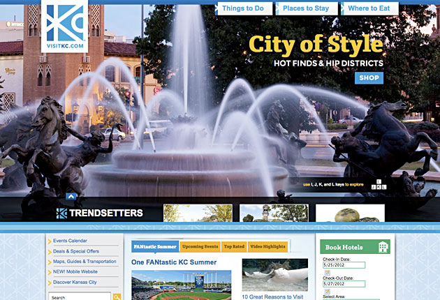
Visit Kansas City
A mobile-optimized website that uses monochromatic blue / green tints and tones throughout. Unique to this site is the ability to interact with the homepage slider using the J, K, L, and I keys on the keyboard. The homepage succeeds at portraying Kansas City as a hip, fun destination but there is a lack of consistency in the individual pages and sub-pages. This is most clearly seen in the strong use of the “Above the Fold” area on the homepage, a concept which is basically absent on all other pages. Every page seems to have it’s own different layout, and the result is a confusing “disconnect.” The size of the body text is very small and difficult for the user to read, causing eyesores. But overall, the content area is too crowded and cluttered, the result is a confusing mess. There’s a lot to this website, but its not really presented in a clear, consistent manner.
High impact search queries for visitkc.com
kansas city mo, city zoo, kansas city hotels, kansas city zoo, worlds of fun, kansas city events, kansas city missouri, downtown kansas city, sprint center, crown center, kansas city activities, tourist spots in kansas city, power and light district
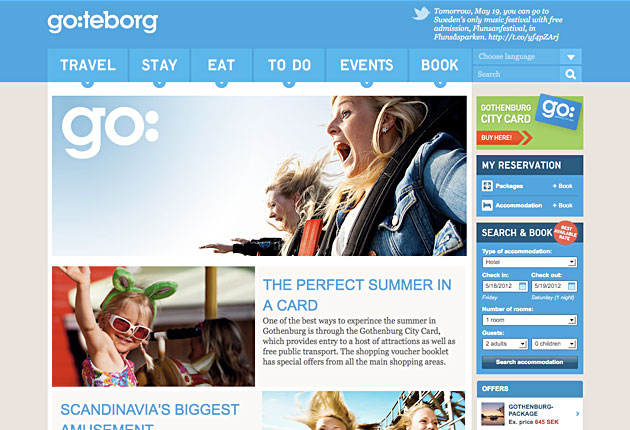
Go: Teborg
Another site using blue / green colors as its brand. This site achieves a very nice use of visual hierarchy. Headlines are easy to read, and different objects on the site’s wireframe synchronize well. The website’s content area uses a grid in an editorial-style layout. The homepage content area has two columns, and an additional column for the sidebar. The inner pages also use a two-column or three-column layout. The consistency and the simplicity are fantastic and the result is information about Gothenburg that is cleanly presented. The sitemap in the footer also aids navigation and helps keep the website’s sidebar and content areas clean and minimalist (a far cry from KC’s site).
The sidebar in general is well-constructed: there are options to buy a Gothenburg city card, make an online reservation, snatch up online deals, connect through social media channels, etc. High Impact Search Queries for goteborg.com/en/
High Impact Search Queries for goteborg.com
Not available for this site.
By State:
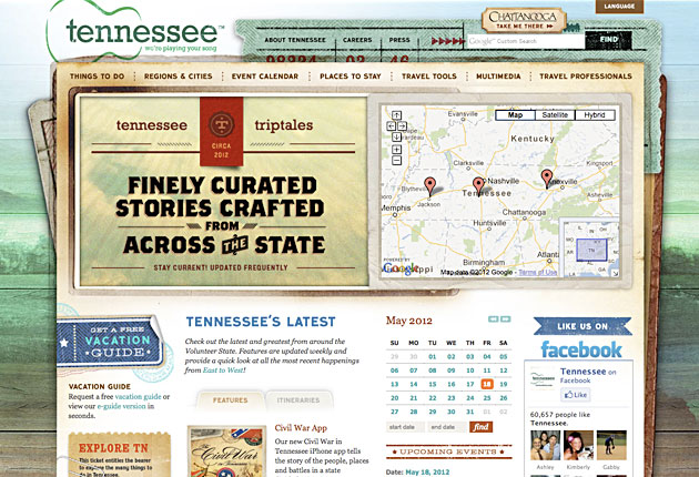
Tennessee Vacation
The background changes with the seasons, to have four different looks through out the year. They also have subsites for each season (spring.tnvacation.com, summer.tnvacation.com, fall.tnvacation.com, winter.tnvacation.com). Great concept, wonderful execution. The site is packed with features and applications, and the design of the “Tennessee Triptales” blog is beautifully branded for Tennessee and the execution is A++ superb: www.tnvacation.com/triptales
High Impact Search Queries for tnvacation.com
tennessee, nashville shores, tn, tennessee attractions, tennessee, ober gatlinburg, dollywood, nashville zoo, tenesee, state of tennessee, clarksville tn, things to do in tennessee, tennessee travel
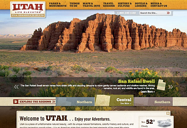
Visit Utah
http://www.visitutah.com/
The site is divided into different regions with micro-sites catering to each: Northern, Southern, and Central Utah. Furthermore, the site uses sub-menus and sub-categories for each category with an abundance of resources for a potential tourist interested in visiting Utah. Each category is a micro-site in and of itself with galleries, links, and articles. The site uses an impressive image and video gallery, which is also optimized for mobile devices. Google mapping technology, an intinerary/adventures planner, a weather application, an events calendar, and an online “Utah Store” are also included.
High Impact Search Queries for visitutah.com
Not available for this site.
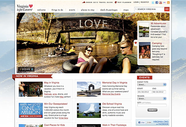
“Virginia is for Lovers.”
Of particularly significant note to the success of Virginia’s tourism is the strength of their slogan, “Virginia is for Lovers.” The first year that the slogan was introduced, travelers spent $800 million in Virginia. By 2004, that number had increased to more than $14 billion (Wikipedia). The emphasis of their website is heavily on current events happening within the communities. There are two “opt-in” offers in the sidebar, including a “2012 Virginia Travel Guide” and an invitation to subscribe to the “Travel Updates” newsletter. They’ve partnered with local vendors to offer hundreds of “Travel Packages,” for families, romantic couples, and culinary lovers.
High Impact Search Queries for virginia.org
busch gardens, leesburg outlets, kings dominion, blue ridge parkway, va, ashburn va, luray caverns, roanoke va, shenandoah national park, buckroe beach, great wolf lodge, woodbridge va, massanutten, water country usa, ashland berry farm
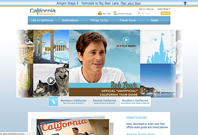
Visit California
http://www.visitcalifornia.com/
The “Visit California” website features a very minimalist design that focuses on the experience of being a Californian. Unique to this site is the “Dream 365 Project” which features a collection of cool, inspirational, and funny videos submitted by Californians who “Dream Big.” The videos in the series are professionally put-together and feature beautiful imagery from the state as a backdrop. In the past, Visit California featured the “Official ‘Unofficial’ California Tour Guide” in the form of a series of short, 3 to 5 minute online videos featuring actor Rob Lowe. Mr. Lowe performs an intimate interview-style video where he speaks about the experiences and places in California. Also included on the site are hundreds of other video and photo galleries, and articles which feature different experiences and places to visit. The navigation is a bit confusing, though, and could be improved upon.
High Impact Search Queries for visitcalifornia.com
california, california map, visit california, attractions southern california, california vacation, honeymoon packages, california tourism, california travel, map of california

The Islands of Hawaii
http://www.gohawaii.com/
The design of the website is beautiful and what really stands out is the strength of the visuals promoting a brand that is exclusively Hawaiian. The website is divided into several parts, with dedicated areas for each of the six islands. Each island has information, galleries, and several other categories of interest: a guidebook, regions, experiences, and a trip planner.
In the sidebar of each island’s micro-site is a useful Vacation Directory application, which is essentially a search function with lists of resources and contact information for travel businesses, hotels, restaurants, etc. There’s also a “My Hawaii” travel planning app where users can add destinations and activities to their online itinerary and share with their friends through their social networks, using Facebook.
High Impact Search Queries for gohawaii.com
hawaii, maui, kauai, hawaii vacations, maui hawaii, big island, oahu, hawai, big island hawaii, kona hawaii, hawaiian islands, hawaii islands, big island hawaii activities, honolulu hawaii, oahu hawaii

Visit Pennsylvania
The site leads off with an interactive Flash player featuring a golfer on a course surrounded by attractions, which are clickable links. A novel approach, but a bit confusing. There’s a lack of strong copy on this website, beginning with the home page, and what copy there is on this site is hidden away. The site is basically a big directory where chooses his or her own adventure. There are too many different colors being used, which hurts the branding, and none are used in a consistent or intelligent fashion. A nice website with standard features, but there’s certainly much better out there. The site gets an F for search engine optimization, as there is little on-site optimization and there’s not even focused keywords any where on the website.
High Impact Search Queries for visitpa.com
hotel bethlehem, dorney park, things to do in pa, king of prussia mall, fall foliage, sesame place, poconos, dutch wonderland, lucanna bank, poconos cabins, pa events

Experience Washington
A well-designed website with a minimal, de-saturated and consistent color palette. A good start to the brand image but could be taken much further (see Go Hawaii). The layout is neatly organized and navigation ties in well with the design, making it easy to browse. Nothing cutting-edge or terribly innovative, but the site is inviting and easily navigable. The site is not well optimized for search – the page titles are not keyword rich, and indeed its lacking focused keyword placement throughout the website.
High Impact Search Queries for experiencewa.com
washington state, washington, ocean shores ca, washington state tourism, tourism, washington tourism, vashon island, state of washington, yakima wa, wa, washington state events, aberdeen wa, vacation in washington state, seattle tourism
By Country:
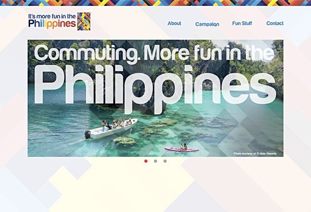
“It’s more fun in the Philippines”
http://itsmorefuninthephilippines.com/
The Philippine government commissioned the local chapter of one of the biggest advertising agency in the world, BBDO Guerrero for the campaign. They also appointed a veteran Advertising Creative Director to help the Department of Tourism with the campaign. The campaign used a lead-in to describe different activities or tourist sites in the Philippines followed by the “It’s More Fun in the Philippines” tagline. The website as a whole seems to still be under construction.
High Impact Search Queries for itsmorefuninthephilippines.com
Not available for this site.
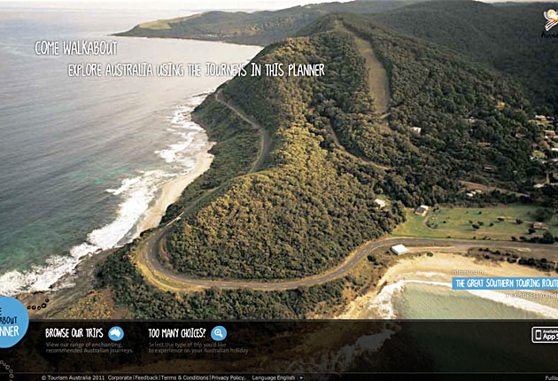
Walkabout Planner Australia
http://walkaboutplanner.australia.com/
The project began with a best practice review of tourism websites around the world. Then conducted a low-fidelity prototyping exercise with visitors that resulted in some unique insights and the big picture strategy. The result was The Walkabout Planner, a user-centric application where users can “visit” Australia online and plan their entire itinerary from the website.
High Impact Search Queries for walkaboutplanner.australia.com
australia, sydney, australia tourism, tourism australia, australie, australia travel, australien, things to do in sydney, travel australia, sydney deals, visit australia, sydney events, great ocean road, sydney festival, australia tour


